Input Controls
Button
| Plain | Host Styled |
|---|---|
|
|
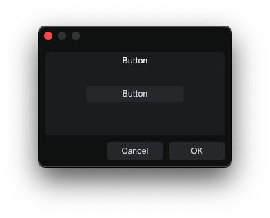
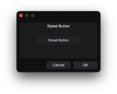
Button is a momentary action trigger.
skin.xml Snippet:
<Button name="Defaults" title="Reset Defaults" width="120" height="24"/>
scriptname.js Snippet:
this.Defaults = context.parameters.addInteger(0, 1, "Defaults");
this.Defaults.value = 0;
| Attribute Name | Description | Type |
|---|---|---|
attach | Layout attachment/alignment. | token |
height | Explicit height. | number |
icon | Overlay icon image resource. | identifier |
image | Named image resource. | identifier |
localize | Localization toggle. | flag |
name | Button binding name. | identifier |
options | Visual or layout options. | token |
size | Position and size geometry. | tuple |
sizelimits | Defines size limits. | tuple |
style | Style reference. | identifier |
title | Display title. | text |
titlename | Title-binding name. | identifier |
tooltip | Tooltip text. | text |
width | Explicit width. | number |
| options | Description |
|---|---|
fittext | - |
focus | - |
hidefocus | Suppresses focus chrome. |
hidetext | Hide text area. |
immediate | Immediate action. |
intermediate | - |
ignoreimagesize | Ignores image size. |
leadingicon | - |
left | Left visual segment drawing position. |
middle | Middle visual segment drawing position. |
needsoptionkey | - |
nocontextmenu | Disable context menu. |
passive | - |
right | Right visual segment drawing position. |
trailingicon | - |
transparent | Transparent button. |
trigger | Self-retriggering action. |
Notes
icon="ResourceName"draws a named image resource on top of the button face.
UpDownButton
UpDownButton is an automatic increment/decrement stepper paired with a bound parameter. Two buttons share the same name — one with options="decrement", the other with options="increment". Clicking them automatically adjusts the param's numeric value without any script handling.
skin.xml Snippet:
<Horizontal spacing="4" attach="hcenter">
  <UpDownButton name="stepValue" options="decrement" width="40" height="40" style="Standard.Button"/>
  <UpDownButton name="stepValue" options="increment" width="40" height="40" style="Standard.Button"/>
</Horizontal>
scriptname.js Snippet:
// Only need to create the param — buttons self-manage
this.stepValue = context.parameters.addInteger(0, 10, "stepValue");
this.stepValue.value = 5;
| Attribute Name | Description | Type |
|---|---|---|
attach | Layout attachment. | token |
height | Explicit height. | number |
icon | Icon resource for the button face. | identifier |
image | Named image resource. | identifier |
name | Bound parameter name (shared by decrement/increment pair). | identifier |
options | Button behavior. | token |
size | Position and size geometry. | tuple |
style | Style reference. | identifier |
tooltip | Tooltip text. | text |
width | Explicit width. | number |
| options | Description |
|---|---|
decrement | Decreases the bound param value on click. |
hidefocus | Suppresses focus chrome. |
increment | Increases the bound param value on click. |
transparent | Transparent button. |
RadioButton
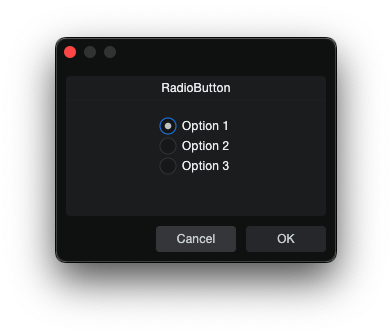
RadioButton is a mutually exclusive selector grouped by shared name.
skin.xml Snippet:
<RadioButton name="Mode" value="0" title="Option 1"/>
<RadioButton name="Mode" value="1" title="Option 2"/>
<RadioButton name="Mode" value="2" title="Option 3"/>
scriptname.js Snippet:
this.Mode = context.parameters.addInteger(0, 2, "Mode");
this.Mode.value = 0;
| Attribute Name | Description | Type |
|---|---|---|
attach | Layout attachment/alignment. | token |
height | Explicit height. | number |
icon | Overlay icon image resource. | identifier |
name | Shared group binding name. | identifier |
options | Visual and behavioral options. | token |
size | Position and size geometry. | tuple |
sizelimits | Defines size limits. | tuple |
style | Style reference. | identifier |
title | Display title. | text |
titlename | Title-binding name. | identifier |
tooltip | Tooltip text. | text |
value | Assigned option value. | number |
width | Explicit width. | number |
| options | Description |
|---|---|
hidefocus | Suppresses focus chrome. |
immediate | Immediate action. |
left | - |
middle | - |
nohelp | - |
passive | - |
right | - |
toggle | Toggle behavior. |
transparent | - |
tristate | - |
Notes
titlealways renders to the right of the radio circle.
CheckBox
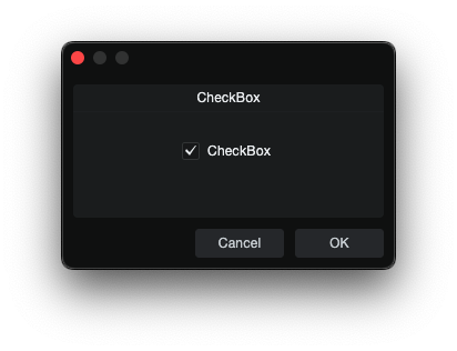
CheckBox is an independent on/off toggle.
skin.xml Snippet:
<CheckBox name="Enabled" value="0" title="Enabled"/>
scriptname.js Snippet:
this.Enabled = context.parameters.addInteger(0, 1, "Enabled");
this.Enabled.value = 0;
| Attribute Name | Description | Type |
|---|---|---|
attach | Layout attachment/alignment. | token |
height | Explicit height. | number |
image | Named image resource. | identifier |
localize | Localization toggle. | flag |
name | Checkbox binding name. | identifier |
options | Visual or behavioral options. | token |
size | Position and size geometry. | tuple |
sizelimits | Defines size limits. | tuple |
style | Style reference. | identifier |
title | Display title. | text |
titlename | Title-binding name. | identifier |
tooltip | Tooltip text. | text |
value | On/off state value. | number |
width | Explicit width. | number |
| options | Description |
|---|---|
hidefocus | Suppresses focus chrome. |
immediate | Immediate action. |
momentary | Momentary state. |
transparent | - |
tristate | - |
Toggle
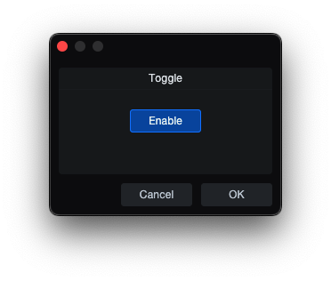
Toggle is an on/off button control.
skin.xml Snippet:
<Toggle name="Enable" title="Enable"/>
scriptname.js Snippet:
this.Enable = context.parameters.addInteger(0, 1, "Enable");
this.Enable.value = 1;
| Attribute Name | Description | Type |
|---|---|---|
attach | Layout attachment/alignment. | token |
height | Explicit height. | number |
icon | Overlay icon image resource. | identifier |
image | Named image resource. | identifier |
name | Toggle binding name. | identifier |
options | Visual and behavior options. | token |
size | Position and size geometry. | tuple |
sizelimits | Defines size limits. | tuple |
style | Style reference. | identifier |
title | Display title. | text |
tooltip | Tooltip text. | text |
value | Assigned option value. | flag |
width | Explicit width. | number |
| options | Description |
|---|---|
directupdate | - |
fittext | - |
hidefocus | Suppresses focus chrome. |
immediate | Immediate action. |
invert | - |
leadingicon | - |
left | Left visual segment drawing position. |
middle | Middle visual segment drawing position. |
momentary | Momentary state flag. |
multiline | - |
needsoptionkey | - |
passive | - |
right | Right visual segment drawing position. |
scaletext | - |
swipe | - |
transparent | - |
trigger | Self-retriggering action. |
ToolButton
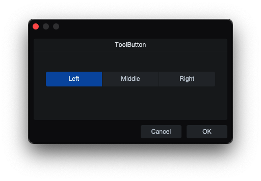
ToolButton is a segmented tool-style button control used for mutually exclusive selections and toggle actions grouped by shared name.
skin.xml Snippet:
<Horizontal margin="0" spacing="1" attach="left right">
  <ToolButton name="Mode" value="0" title="Left"
              width="110" height="29" options="hidefocus left"/>
  <ToolButton name="Mode" value="1" title="Middle"
              width="110" height="29" options="hidefocus middle"/>
  <ToolButton name="Mode" value="2" title="Right"
              width="110" height="29" options="hidefocus right"/>
</Horizontal>
scriptname.js Snippet:
this.Mode = context.parameters.addInteger(0, 2, "Mode");
| Attribute Name | Description | Type |
|---|---|---|
attach | Layout attachment/alignment. | token |
height | Explicit height. | number |
icon | Overlay icon image resource. | identifier |
name | ToolButton binding name. | identifier |
modename | Mode binding name. | identifier |
options | Button behavior tokens. | token |
sizelimits | Position and size geometry. | tuple |
style | Style reference. | identifier |
title | Visible title text. | text |
tooltip | Tooltip text. | text |
value | Assigned option value. | number |
width | Explicit width. | number |
| options | Description |
|---|---|
hidefocus | Suppresses focus highlighting. |
immediate | Immediate action. |
left | Left visual segment drawing position. |
middle | Middle visual segment drawing position. |
right | Right visual segment drawing position. |
toggle | Toggle behavior. |
Notes
- Wrap in
<Horizontal spacing="0">to render it horizontally. LeftMiddleRightdraw buttons as left, middle, or right segments, visual only.
DialogButton
DialogButton creates a clickable button that returns a dialog result, used inside dialog forms. Unlike <Button> which dispatches script commands, DialogButton maps to the dialog's result system.
skin.xml Snippet:
<DialogButton result="okay" title="Confirm"/>
| Attribute Name | Description | Type |
|---|---|---|
attach | Layout attachment/alignment. | token |
height | Explicit height. | number |
name | Dialog button name. | identifier |
result | Dialog result value. | token |
style | Style reference. | identifier |
title | Display label. If omitted, auto-generated from result. | text |
| result | Description |
|---|---|
okay | Returns result equivalent to OK. |
cancel | Returns result equivalent to Cancel. |
close | Returns result equivalent to Close. |
apply | Applies changes without closing. |
Notes
DialogButtonis a normal flow element — it must be inside a layout container (<Vertical>,<Horizontal>), not as a form-level orphan otherwise it renders overlaying earlier elements.
EditBox
| Plain | Host Styled |
|---|---|
|
|
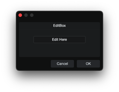
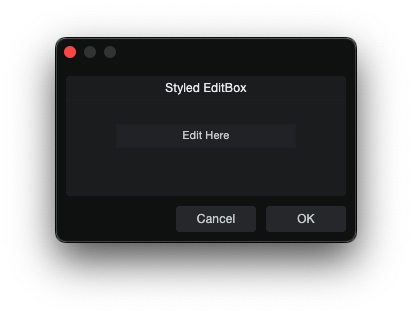
EditBox is an editable text field that accepts typed text and commits its value back to script.
skin.xml Snippet:
<EditBox name="InputText" width="180" height="22"/>
scriptname.js Snippet:
this.InputText = context.parameters.addString("InputText");
this.InputText.value = "";
| Attribute Name | Description | Type |
|---|---|---|
attach | Layout attachment/alignment. | token |
colorname | Color-binding name. | identifier |
value | Initial field value. | text |
localize | Localization toggle. | flag |
name | EditBox binding name. | identifier |
height | Explicit height. | number |
options | Visual and behavioral options. | token |
placeholder | Placeholder text. | text |
size | Position and size geometry. | tuple |
sizelimits | Defines size limits. | tuple |
style | Style reference. | identifier |
texttrimmode | Text trimming mode. | token |
title | Display title. | text |
tooltip | Tooltip text. | text |
width | Explicit width. | number |
| options | Description |
|---|---|
border | Visible field border. |
dialogedit | - |
doubleclick | - |
email | Email input field. |
extended | Extended editing. |
focus | - |
fittext | Fit text. |
hidefocus | Suppresses focus chrome. |
immediate | - |
markup | - |
multiline | Multi-line edit mode. |
musthittext | - |
password | Password input field. |
scaletext | - |
vertical | Enables vertical overflow/scrollbar behavior. |
transparent | Transparent edit background. |
Notes
- EditBox text can be prefilled by setting the parameter
.valuebefore the dialog opens. - For multiline
EditBoxcontrols, apply a style alignment such as<Align name="textalign" align="left top"/>. - Use
options="multiline vertical"with long overflow content for visible edit/focus-state scrollbar behavior.
TextEditor
TextEditor is a multi-line text editing widget for longer editable text content.
skin.xml Snippet:
<Style name="TextEditorStyle" textoptions="wordbreak">
  <Font name="textfont" themeid="PresonusUI" size="14"/>
  <Align name="textalign" align="left top"/>
  <Color name="backcolor" color="#1A1C1D"/>
  <Color name="textcolor" color="#FFFFFF"/>
</Style>
...
<TextEditor name="notes" options="small multiline autohidev" width="480" height="260" style="TextEditorStyle"/>
scriptname.js Snippet:
this.notes = context.parameters.addString("notes");
this.notes.value = "";
| Attribute Name | Description | Type |
|---|---|---|
attach | Layout attachment/alignment. | token |
height | Explicit height. | number |
name | TextEditor binding name. | identifier |
options | Visual and behavioral options. | token |
size | Position and size geometry. | tuple |
style | Style reference (required — crash without one). | identifier |
vscroll.style | Vertical scrollbar style. | identifier |
width | Explicit width. | number |
| options | Description |
|---|---|
autohidev | Auto-hide vertical scrollbar. |
multiline | Multi-line edit mode. |
small | Smaller scrollbar thumb size. |
Notes
- A
styleattribute is required — omitting it crashes Studio Pro. - Text wrapping requires
textoptions="wordbreak"on the style. Without it, text stays single-line with ellipsis truncation. - Two dialog systems available:
CCL:ParamList+Host.GUI.runDialog()(preferred — no auto-restore of previous values).context.parameters+context.runDialog()(auto-restores cached values globally).
ValueBox
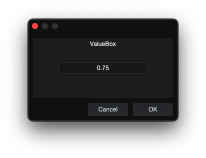
ValueBox is an editable value field that can accept typed values and can be
written back from script.
skin.xml Snippet:
<ValueBox name="ValueText" width="140" height="22"/>
scriptname.js Snippet:
this.ValueText = context.parameters.addString("ValueText");
this.ValueText.value = "";
| Attribute Name | Description | Type |
|---|---|---|
attach | Layout attachment/alignment. | token |
height | Explicit height. | number |
colorname | Color-binding name. | identifier |
labelname | Label-binding name. | identifier |
localize | Localization toggle. | flag |
name | ValueBox binding name. | identifier |
options | Visual or behavioral options. | token |
size | Position and size geometry. | tuple |
sizelimits | Defines size limits. | tuple |
style | Style reference. | identifier |
tooltip | Tooltip text. | text |
units | Display unit. | identifier |
width | Explicit width. | number |
xyediting | Vertical drag sensitivity. | number |
| options | Description |
|---|---|
dialogedit | - |
doubleclick | Double-click behavior. |
fittext | Fit text. |
hidefocus | Hide focus. |
hidetext | Hide text area. |
inversewheel | Invert wheel direction. |
nodrag | Disable drag. |
nowheel | Disable mousewheel interaction. |
scaletext | Scale text. |
transparent | Transparent rendering. |
Notes
- ValueBox can be prefilled by setting the parameter
.valuebefore the dialog opens. - It can display a user-facing unit while the script stores a different underlying unit; see Crossfade Tool.
Slider
| Plain | Host Styled |
|---|---|
|
|
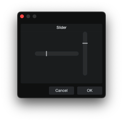
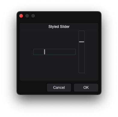
Slider is a slider control.
skin.xml Snippet:
<Horizontal spacing="2" attach="left right">
  <Slider name="TimeSlider" width="100" height="20"
          options="horizontal" style="Standard.AddIn.Slider"/>
  <EditBox name="TimeSlider" width="45" height="20"/>
  <Label title="ms"/>
</Horizontal>
scriptname.js Snippet:
this.TimeSlider = context.parameters.addFloat(-1, 1, "TimeSlider");
this.TimeSlider.value = -0.25;
| Attribute Name | Description | Type |
|---|---|---|
attach | Layout attachment/alignment. | token |
height | Explicit height. | number |
mode | Slider interaction mode. | identifier |
name | Slider binding name. | identifier |
colorname | Color-binding name. | identifier |
options | Visual and behavioral options. | token |
size | Position and size geometry. | tuple |
sizelimits | Defines size limits. | tuple |
style | Style reference. | identifier |
title | Display title. | text |
tooltip | Tooltip text. | text |
width | Explicit width. | number |
xyediting | Vertical drag sensitivity. | number |
| mode | Description |
|---|---|
relative | - |
| options | Description |
|---|---|
bargraph | - |
centered | - |
composited | - |
directupdate | - |
globalmode | - |
horizontal | Horizontal slider. |
passive | - |
thinhandle | Thin-handle |
tickscale | - |
tooltip | Value adjustment tooltip. |
vertical | Vertical slider. |
transparent | Transparent slider. |
xyediting | Allows vertical drag adjustment. |
RangeSlider
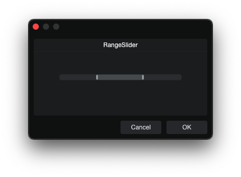
RangeSlider is a dual-handle slider used to control a start and end value.
skin.xml Snippet:
<RangeSlider name="RangeStart" name2="RangeEnd"
             width="240" height="14"
             options="bargraph horizontal tooltip" attach="vcenter"/>
scriptname.js Snippet:
this.RangeStart = context.parameters.addFloat(0, 1, "RangeStart");
this.RangeEnd = context.parameters.addFloat(0, 1, "RangeEnd");
this.RangeStart.value = 0.25;
this.RangeEnd.value = 0.75;
| Attribute Name | Description | Type |
|---|---|---|
attach | Layout attachment. | token |
name | Primary binding name. | identifier |
name2 | Secondary binding name. | identifier |
options | Visual and behavioral options. | token |
size | Position and size geometry. | tuple |
style | Style Reference. | identifier |
width | Explicit width. | number |
| options | Description |
|---|---|
bargraph | - |
directupdate | Updates value directly while dragging. |
horizontal | Horizontal slider. |
invertible | Allows inverted slider behavior. |
tooltip | Value adjustment tooltip. |
xyediting | Allows vertical drag adjustment. |
Knob
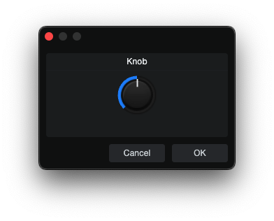
Knob is a rotary control.
skin.xml Snippet:
<Vertical spacing="5">
  <Knob name="MyKnob" width="60" height="60"/>
  <ValueBox name="MyKnobDisplay" width="60" height="20"/>
</Vertical>
scriptname.js Snippet:
this.MyKnob = context.parameters.addInteger(0, 127, "MyKnob");
this.MyKnobDisplay = context.parameters.addString("MyKnobDisplay");
this.MyKnobDisplay.value = String(this.MyKnob.value);
| Attribute Name | Description | Type |
|---|---|---|
attach | Layout attachment/alignment. | token |
height | Explicit height. | number |
name | Knob binding name. | identifier |
options | Visual or behavioral options. | token |
colorname | Color-binding name. | identifier |
referencename | Reference binding name. | identifier |
size | Position and size geometry. | tuple |
style | Style reference. | identifier |
tooltip | Tooltip text. | text |
width | Explicit width. | number |
| options | Description |
|---|---|
centered | Bipolar / center-zero mode (use addFloat(-1, 1, ...) in script). |
inversewheel | Inverted mousewheel scroll. |
passive | Passive knob adjustment behavior. |
reverse | Reverse value direction. |
tooltip | Value adjustment tooltip. |
vertical | - |
Notes
options="centered"enables bipolar mode. The knob sits at center (0) by default. UseaddFloat(-1, 1, ...)for the script parameter. 1 = fully clockwise, -1 = fully counter-clockwise.- No custom style is needed — centered works with the default knob appearance.
colornameoverrideshilitecoloron the knob. Usecontext.parameters.addColor("name")in script. Color format:0xAABBGGRR.
ColorBox
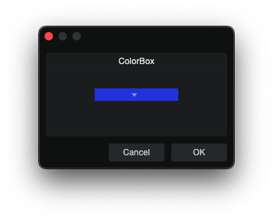
ColorBox is a compound color picker that requires a nested SelectBox to
render its popup and bound color value.
skin.xml Snippet:
<ColorBox name="Color1" width="120" height="18" attach="hcenter vcenter">
  <SelectBox name="Color1" width="120" height="18"
             options="border transparent hidetext hidefocus"/>
</ColorBox>
scriptname.js Snippet:
this.Color1 = context.parameters.addColor("Color1");
this.Color1.palette = Host.Engine.TrackColorPalette;
this.Color1.value = 0xFF2F4DE4;
| Attribute Name | Description | Type |
|---|---|---|
attach | Layout attachment/alignment. | token |
height | Explicit height. | number |
name | ColorBox binding name. | identifier |
options | Visual and behavioral options. | token |
radius | Corner radius. | number |
size | Position and size geometry. | tuple |
style | Style reference. | identifier |
tooltip | Tooltip text. | text |
width | Explicit width. | number |
| options | Description |
|---|---|
border | Visible field border. |
nowheel | Disable mousewheel interaction. |
ComboBox
| Plain | Local Styled |
|---|---|
|
|
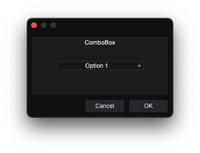
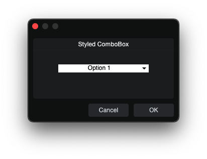
ComboBox is a dropdown selector for choosing one item from a list of
script-provided values.
skin.xml Snippet:
<Styles>
  <Style name="ComboColor">
    <Color name="backcolor" color="#FFFFFF"/>
    <Color name="textcolor" color="#000000"/>
  </Style>
</Styles>

<ComboBox name="Choice" width="180" style="ComboColor"/>
scriptname.js Snippet:
this.Choice = context.parameters.addList("Choice");
this.Choice.appendString("Option 1");
this.Choice.appendString("Option 2");
this.Choice.value = 0;
| Attribute Name | Description | Type |
|---|---|---|
attach | Layout attachment/alignment. | token |
editname | Associated editable field binding. | identifier |
height | Explicit height. | number |
name | ComboBox binding name. | identifier |
options | Visual and behavioral options. | token |
size | Position and size geometry. | tuple |
style | Style reference. | identifier |
tooltip | Tooltip text. | text |
width | Explicit width. | number |
| options | Description |
|---|---|
border | Visible field border. |
doubleclick | - |
fittext | Fit text. |
hidefocus | Suppresses focus chrome. |
ignorekeys | Ignore keys. |
nowheel | Disable mousewheel interaction. |
stayopenonclick | Keep popup open on click. |
translucent | Translucent rendering. |
transparent | Transparent ComboBox. |
Notes
- Population uses
addList()plusappendString(). - See CCL:ParamList for
addList()andappendString().
SelectBox
| Plain | Host Styled |
|---|---|
|
|
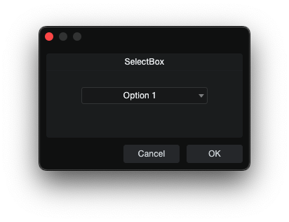
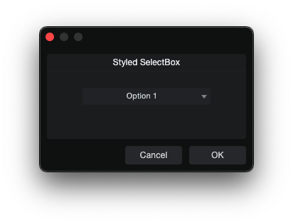
SelectBox is a taller dropdown selector than ComboBox, intended for
list-style selection in dialogs.
skin.xml Snippet:
<SelectBox name="Choice" width="180" style="Standard.AddIn.SelectBox"/>
scriptname.js Snippet:
this.Choice = context.parameters.addList("Choice");
this.Choice.appendString("Option 1");
this.Choice.appendString("Option 2");
this.Choice.value = 0;
| Attribute Name | Description | Type |
|---|---|---|
attach | Layout attachment/alignment. | token |
height | Explicit height. | number |
name | SelectBox binding name. | identifier |
options | Visual and behavioral options. | token |
popupstyle | Popup style reference. | identifier |
localize | Localization toggle. | flag |
popup | Popup binding name. | identifier |
size | Position and size geometry. | tuple |
sizelimits | Defines size limits. | tuple |
style | Style reference. | identifier |
title | Display title. | text |
texttrimmode | Text trimming mode. | token |
value | Assigned value. | number |
tooltip | Tooltip text. | text |
width | Explicit width. | number |
| options | Description |
|---|---|
border | Visible field border. |
fittext | Fit text. |
hidebutton | Hides the dropdown button. |
hidefocus | Hides focus chrome. |
hidetext | Hide text area. |
ignorekeys | Ignore keys. |
inversewheel | Invert wheel direction. |
leadingbutton | Places button at leading edge. |
left | - |
nocontextmenu | Disable context menu. |
nohelp | - |
nomodifier | Suppress modifier-key. |
nowheel | Disable mousewheel interaction. |
offstate | - |
scaletext | - |
showtitle | - |
stayopenonclick | Keep popup open on click. |
trailingbutton | Places button at trailing edge. |
transparent | Transparent background. |
Notes
- Population uses
addList()plusappendString(). - See CCL:ParamList for
addList()andappendString().
PopupBox
PopupBox opens a popup overlay when clicked.
skin.xml Snippet (form popup):
<PopupBox form.name="MyPopupContent" popup="right bottom">
  <Button title="Options" width="60" height="30"/>
</PopupBox>
Popup content form (requires using controller="source"):
<Form name="MyPopupContent" attach="all fitsize">
  <using controller="source">
    <Vertical margin="10" spacing="8" attach="all">
      <CheckBox name="myCheck" value="0" title="Enable"/>
      <Toggle name="myToggle" title="Toggle mode"/>
      <TextBox name="myNotes" width="200" height="40" options="multiline"/>
    </Vertical>
  </using>
</Form>
| Attribute Name | Description | Type |
|---|---|---|
attach | Layout attachment/alignment. | token |
form.name | Form to open as popup content. | identifier |
height | Explicit height. | number |
name | Parameter binding (for vertical slider mode) or popup identifier. | identifier |
options | Behavior flags. | token |
popup | Popup open direction/position. | token |
popupstyle | Style override for the popup window. | identifier |
size | Position and size geometry. | tuple |
sizelimits | Size limit configuration. | tuple |
style | Style reference. | identifier |
tooltip | Tooltip text. | text |
width | Explicit width. | number |
| options | Description |
|---|---|
nowheel | Disables mouse wheel interaction. |
slider | Uses slider popup behavior (combined with vertical). |
transparent | Renders popup with transparent background. |
vertical | Vertical orientation (used with slider). |
Notes
form.name— opens a separate<Form>as the popup content.- For
form.namepopups, the referenced form must include<using controller="source">for child element params to communicate back to the parent controller. - Popup form params are created on
this.paramList(addParam,addString). - The
options="vertical slider"pattern is a native built-in slider popup that binds vianameto ranged parameter e.g.context.parameters.addFloat(). - Popup style metrics are defined in
<Style>and referenced bypopupstyle.