Text & Display
Label
| Plain | Local Styled |
|---|---|
|
|
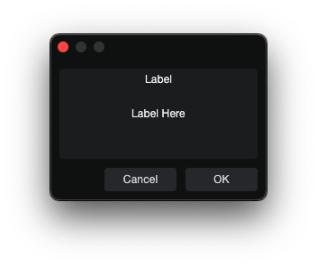
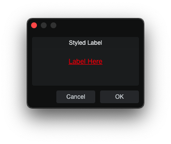
Label is a static text element.
skin.xml Snippet:
<Label title="Static Label"/>
| Attribute Name | Description | Type |
|---|---|---|
attach | Layout attachment/alignment. | token |
height | Explicit height. | number |
localize | Localization toggle. | flag |
options | Visual or behavioral options. | token |
size | Position and size geometry. | tuple |
sizelimits | Defines size limits. | tuple |
style | Style reference. | identifier |
title | Visible title text. | text |
tooltip | Hover help text. | text |
value | - | text |
width | Explicit width. | number |
| options | Description |
|---|---|
colorize | - |
fittext | - |
multiline | Multi-line editing mode. |
nohelp | - |
transparent | Transparent rendering. |
Link
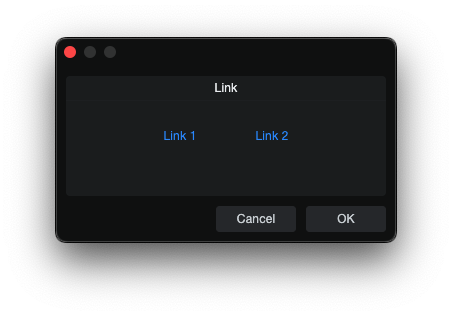
Link is a clickable text-style control.
skin.xml Snippet:
<Horizontal spacing="8">
  <Link name="Link 1" title="Link 1" attach="vcenter" style="MyLinkStyle"/>
  <Link name="Link 2" title="Link 2" attach="vcenter" style="MyLinkStyle"/>
</Horizontal>
scriptname.js Snippet:
this.paramList = Host.Classes.createInstance("CCL:ParamList");
this.paramList.controller = this;

this.Link1 = this.paramList.addParam("Link 1");
this.Link2 = this.paramList.addParam("Link 2");

this.paramChanged = function(param)
{
    if(param == this.Link1)
        Host.GUI.openUrl(Host.Url("https://example.com/", true));
    else if(param == this.Link2)
        Host.GUI.openUrl(Host.Url("local://$USERCONTENT", true));
}
| Attribute Name | Description | Type |
|---|---|---|
attach | Layout attachment/alignment. | token |
height | Explicit height. | number |
name | Link binding name. | identifier |
options | Visual or behavioral options. | token |
size | Position and size geometry. | tuple |
style | Style reference. | identifier |
title | Display title. | text |
tooltip | Tooltip text. | text |
width | Explicit width. | number |
| options | Description |
|---|---|
button | - |
fittext | - |
fittitle | - |
transparent | - |
urltitle | - |
Notes
- JS surface binds
LinkthroughaddParam(...)and handles clicks inparamChanged(...).
TextBox
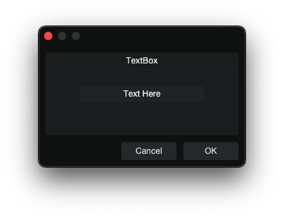
TextBox is an uneditable display field.
skin.xml Snippet:
<TextBox name="DisplayText" width="360" height="48"/>
scriptname.js Snippet:
this.DisplayText = context.parameters.addString("DisplayText");
this.DisplayText.value = "";
| Attribute Name | Description | Type |
|---|---|---|
attach | Layout attachment/alignment. | token |
colorname | - | identifier |
height | Explicit height. | number |
name | TextBox binding name. | identifier |
options | Visual or behavioral options. | token |
size | Position and size geometry. | tuple |
sizelimits | Defines size limits. | tuple |
style | Style reference. | identifier |
texttrimmode | Text trimming mode. | token |
tooltip | Tooltip text. | text |
width | Explicit width. | number |
| options | Description |
|---|---|
border | Visible field border. |
composited | - |
directupdate | - |
fittext | - |
hfit | - |
hidefocus | - |
markup | - |
multiline | Multi-line display mode. |
nocontextmenu | Disable the context menu. |
nohelp | - |
scaletext | - |
transparent | Transparent display. |
Notes
- TextBox can be prefilled by setting the parameter
.valuebefore the dialog opens. - For multiline
TextBoxcontrols, apply a style alignment such as<Align name="textalign" align="left top"/>.
ImageView
ImageView displays a named image resource, ImagePart, or ShapeImage.
skin.xml Snippet:
<Vertical spacing="4">
  <ImageView image="LeftSegment" width="24" height="48" tooltip="Left segment"/>
  <ImageView image="RightSegmentTinted" width="24" height="48" tooltip="Tinted right segment"/>
</Vertical>
| Attribute Name | Description | Type |
|---|---|---|
attach | Layout attachment/alignment. | token |
height | Explicit height. | number |
image | Named image resource. | identifier |
options | Visual or behavioral options. | token |
provider | Host-provided image source. | identifier |
selectname | Selection-binding name. | identifier |
size | Rectangle geometry. | tuple |
sizelimits | Defines size limits. | tuple |
style | Style reference. | identifier |
tooltip | Tooltip text. | text |
width | Explicit width. | number |
| options | Description |
|---|---|
allowstretch | - |
allowzoom | Zoom behavior. |
centerimage | Center image. |
colorize | Colorize the form area. |
fitimage | Fit image to area. |
highquality | High-quality rendering. |
ignoreimagesize | Ignore image size. |
insertdata | - |
nohelp | - |
swallowmouse | - |
translucent | - |
transparent | - |
windowmovable | Allow drag from form area. |
Notes
ImageViewcan sit inside a container like a normal visual control.
Divider
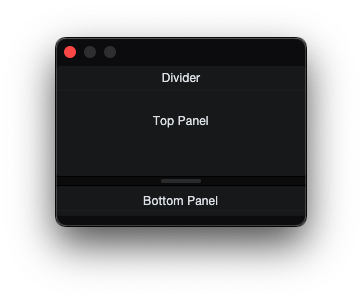
Divider is a visible separator control that can also function as a draggable splitter handle.
skin.xml Snippet:
  <Vertical margin="0" spacing="0" attach="all">
    <DialogGroup title="Divider" size="0,0,250,70" sizelimits="0,20,250,-1" attach="all fill">
      <Label title="Top Panel" attach="hcenter vcenter"/>
    </DialogGroup>
    <Divider name="Divider" options="vertical" size="0,0,250,10" attach="left right"/>
    <DialogGroup size="0,0,250,70" sizelimits="0,20,250,-1" attach="all fill">
      <Label title="Bottom Panel" attach="hcenter vcenter"/>
    </DialogGroup>
  </Vertical>
| Attribute Name | Description | Type |
|---|---|---|
attach | Layout attachment/alignment. | token |
height | Explicit height. | number |
name | Divider binding name. | identifier |
options | Visual or behavioral options. | token |
outreach | Divider outreach amount. | number |
size | Position and size geometry. | tuple |
style | Style reference. | identifier |
margin | Divider margin. | number |
width | Explicit width. | number |
| options | Description |
|---|---|
horizontal | Horizontal orientation (left-right split). |
vertical | Vertical orientation (top-bottom split). |
small | Small variant. |
transparent | Transparent rendering. |
master | Master divider in a linked pair. |
slave | Slave divider in a linked pair. |
push | Pushes adjacent panel instead of resizing. |
reverse | Reverse drag direction. |
outreachleft | Outreach in left direction. |
outreachright | Outreach in right direction. |
outreachbottom | Outreach in bottom direction. |
outreachtop | Outreach in top direction. |
Notes
- For a draggable splitter, use
attach="all fill"andsizelimitstuple to be resizable.
ProgressBar
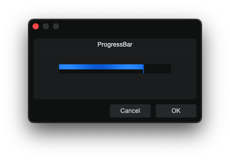
ProgressBar is a bound progress indicator used to show stepped or continuous
progress updates inside a dialog layout.
skin.xml Snippet:
<ProgressBar name="ProgressValue" width="140" height="18" options="horizontal"/>
scriptname.js Snippet:
this.ProgressValue = context.parameters.addInteger(0, 100, "ProgressValue");
this.ProgressValue.value = 75;
| Attribute Name | Description | Type |
|---|---|---|
attach | Layout attachment/alignment. | token |
height | Explicit height. | number |
name | ProgressBar binding name. | identifier |
options | Orientation option. | token |
width | Explicit width. | number |
| options | Description |
|---|---|
horizontal | Horizontal ProgressBar. |
Notes
ProgressBarcan be driven byaddInteger(...)oraddFloat(...).
ActivityIndicator
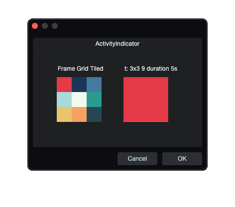
ActivityIndicator is an animated image playback control. It renders the style's foreground image and makes Image frames sprite-sheet animation values visible.
skin.xml Snippet:
<Image name="FrameGridTiled" url="images/example-frame-grid-3x3.png"
       frames="t: 3x3 9" duration="5 s"/>

<Style name="FrameGridTiledStyle">
  <Image name="foreground" image="FrameGridTiled"/>
</Style>

<ActivityIndicator width="90" height="90" style="FrameGridTiledStyle"/>
| Attribute Name | Description | Type |
|---|---|---|
attach | Layout attachment/alignment. | token |
height | Explicit height. | number |
name | ActivityIndicator control name. | identifier |
options | Rendering and update behavior. | token |
size | Position and size geometry. | tuple |
style | Style reference. | identifier |
tooltip | Tooltip text. | text |
width | Explicit width. | number |
| options | Description |
|---|---|
composited | - |
directupdate | - |
transparent | - |
Notes
ActivityIndicatoruses a style that assigns anImageto theforegroundslot.- When that
Imageresource hasframes="t: ..."andduration, the control plays the sprite-sheet animation.