Layout Containers
Vertical
Vertical is a layout container that stacks child elements vertically.
skin.xml Snippet:
<Vertical spacing="8" margin="10" attach="left right">
  <!-- children stacked vertically -->
</Vertical>
| Attribute Name | Description | Type |
|---|---|---|
attach | Layout attachment/alignment. | token |
height | Explicit height. | number |
margin | Inner padding around the container contents. | number |
options | Visual or layout options. | token |
persistence.id | Persistent layout state key. | identifier |
size | Position and size geometry. | tuple |
sizelimits | Defines size limits. | tuple |
spacing | Space between children. | number |
width | Explicit width. | number |
name | Container binding name. | identifier |
title | Display title. | text |
| options | Description |
|---|---|
adaptive | - |
hidepriority | - |
nohelp | - |
secondary | - |
unifysizes | - |
Horizontal
Horizontal is a layout container that arranges child elements horizontally.
skin.xml Snippet:
<Horizontal spacing="4" margin="5" attach="left right">
  <!-- children arranged horizontally -->
</Horizontal>
| Attribute Name | Description | Type |
|---|---|---|
attach | Layout attachment/alignment. | token |
height | Explicit height. | number |
margin | Inner padding around the container contents. | number |
options | Visual or layout options. | token |
persistence.id | Persistent layout state key. | identifier |
size | Position and size geometry. | tuple |
sizelimits | Defines size limits. | tuple |
spacing | Space between children. | number |
width | Explicit width. | number |
columns | Columns in the layout. | number |
name | Container binding name. | identifier |
style | Style reference. | identifier |
title | Display title. | text |
tooltip | Tooltip text. | text |
| options | Description |
|---|---|
hidepriority | - |
unifysizes | - |
wrap | - |
View
View is a layout wrapper and positioned container.
skin.xml Snippet:
<View size="40,10,150,220">
  <Vertical spacing="2">
    ...
  </Vertical>
</View>
| Attribute Name | Description | Type |
|---|---|---|
attach | Layout attachment/alignment. | token |
height | Explicit height. | number |
margin | Inner padding around container contents. | number |
name | Wrapper name. | identifier |
options | Visual or layout options. | token |
size | Position and size geometry. | tuple |
sizelimits | Defines size limits. | tuple |
style | Style reference. | identifier |
title | Display title. | text |
tooltip | Tooltip text. | text |
type | View subtype. | identifier |
width | Explicit width. | number |
| options | Description |
|---|---|
directupdate | - |
horizontal | Horizontal orientation. |
transparent | Transparent rendering. |
vertical | Vertical orientation. |
Notes
Viewis used to position blocks of controls while innerVerticalandHorizontalcontainers handle local flow.
DialogGroup
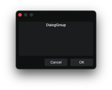
DialogGroup is a visible container for housing other elements.
skin.xml Snippet:
<Form name="DialogGroupExample" title="DialogGroup Example">
  <DialogGroup title="Value Fields" width="220" height="100">
    <Vertical margin="8" spacing="4">
      <Label title="ValueBox and TextBox"/>
      <ValueBox name="ValueText" width="140" height="22"/>
      <TextBox name="DisplayText" width="180" height="22"/>
    </Vertical>
  </DialogGroup>
</Form>
| Attribute Name | Description | Type |
|---|---|---|
attach | Layout attachment/alignment. | token |
height | Explicit height. | number |
options | Visual and behavioral settings. | token |
size | Position and size geometry. | tuple |
sizelimits | Defines size limits. | tuple |
style | Style reference. | identifier |
title | Display title. | text |
width | Explicit width. | number |
| options | Description |
|---|---|
secondary | - |
transparent | Transparent rendering. |
Table
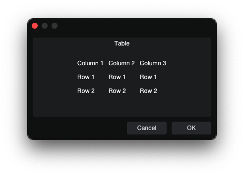
Table is a grid layout container. Child elements are assigned to cells in
source order, moving left to right across each row and then continuing on the
next row.
skin.xml Snippet:
<Table columns="2" margin="0" spacing="6">
  <Label title="Name"/>
  <EditBox name="Name"/>

  <Label title="Count"/>
  <ValueBox name="Count"/>
</Table>
| Attribute Name | Description | Type |
|---|---|---|
attach | Layout attachment/alignment. | token |
cellratio | Cell sizing ratio. | number |
columns | Number of columns in the grid. | number |
height | Explicit height. | number |
margin | Inner padding around the table contents. | number |
name | Table binding name. | identifier |
size | Table geometry. | tuple |
spacing | Space between cells. | number |
sizelimits | Defines size limits. | tuple |
width | Explicit width. | number |
Notes
- Ex. With
columns="2", children fill table in order of placement, top to bottom: row 1 col 1, row 1 col 2, row 2 col 1, row 2 col 2. <Null/>can be used as an empty placeholder cell.
Space
Space is a lightweight layout spacer used to add fixed blank area between
controls.
skin.xml Snippet:
<Vertical margin="0" spacing="8">
  <Label title="Top Control"/>
  <Space height="4"/>
  <Label title="Bottom Control"/>
</Vertical>
| Attribute Name | Description | Type |
|---|---|---|
attach | Layout attachment/alignment. | token |
name | Space name. | identifier |
height | Fixed spacer height. | number |
size | Position and size geometry. | tuple |
sizelimits | Defines size limits. | tuple |
width | Fixed spacer width. | number |
TabView
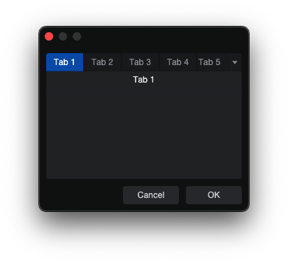
TabView is a multi-page container.
skin.xml Snippet:
<TabView name="OptionTabs" width="300" height="180">
  <DialogGroup title="Tab 1">
  <!-- tab content -->
  </DialogGroup>
  <Control title="Tab 2">
  <!-- tab content -->
  </Control>
  <View title="Tab 3">
  <!-- tab content -->
  </View>
</TabView>
| Attribute Name | Description | Type |
|---|---|---|
attach | Layout attachment/alignment. | token |
height | Explicit height. | number |
name | Tabview binding name. | identifier |
options | Visual or behavioral options. | token |
persistence.id | Persistent layout state key. | identifier |
size | Explicit size geometry. | tuple |
sizelimits | Defines size limits. | tuple |
style | Style reference. | identifier |
width | Explicit width. | number |
| options | Description |
|---|---|
extendtabs | - |
fitallviews | - |
fontbold | - |
nohoveractivate | - |
reorder | - |
Notes
- Confirmed page container types:
DialogGroup,Control,View,Table. - Use each child page container
titlefor the tab label. - A dropdown is added automatically when the tab strip exceeds available width.
Flexbox
Flexbox arranges children in a row or column with flexbox-style alignment, distribution, and sizing — similar to CSS Flexbox.
skin.xml Snippet:
<Flexbox flex.gap="10" width="500">
  <Toggle name="opt1" title="One" width="100" height="30"/>
  <Toggle name="opt2" title="Two" width="100" height="30"/>
  <Toggle name="opt3" title="Three" width="100" height="30"/>
</Flexbox>

<Flexbox flex.direction="column" flex.align="center" flex.gap="5" width="500">
  <Toggle name="top" title="Top" width="200" height="30"/>
  <Toggle name="bottom" title="Bottom" width="200" height="30"/>
</Flexbox>

<Flexbox flex.justify="spacebetween" width="500">
  <Button name="left" title="Left" width="80" height="30"/>
  <Button name="center" title="Center" width="80" height="30"/>
  <Button name="right" title="Right" width="80" height="30"/>
</Flexbox>

<Flexbox flex.gap="5" width="500">
  <Toggle name="a" title="1/3" flex.grow="1" height="30"/>
  <Toggle name="b" title="1/3" flex.grow="1" height="30"/>
  <Toggle name="c" title="1/3" flex.grow="1" height="30"/>
</Flexbox>
| Attribute Name | Description | Type |
|---|---|---|
attach | Layout attachment/alignment. | token |
flex.align | Cross-axis alignment (like CSS align-items). | token |
flex.direction | Flex direction — row or column. | token |
flex.gap | Spacing between children. | number |
flex.justify | Main-axis distribution (like CSS justify-content). | token |
flex.margin | Margin around the flex container. | number |
flex.padding | Padding inside the flex container. | tuple |
height | Explicit height. | number |
size | Position and size geometry. | tuple |
tooltip | Tooltip text. | text |
width | Explicit width. | number |
| flex.align | Description |
|---|---|
center | Center children on the cross axis. |
| flex.direction | Description |
|---|---|
row | Horizontal layout (default). |
column | Vertical layout. |
| flex.justify | Description |
|---|---|
center | Center children on the main axis. |
spacebetween | Distribute children evenly with space between. |
Child attributes (flex-item):
| Attribute | Description | Type |
|---|---|---|
flex.grow | Grow factor for filling available space. | number |
flex.positiontype | Positioning mode. | token |
flex.inset | Inset for absolute positioning. | token |
| flex.positiontype | Description |
|---|---|
absolute | Positions child outside flow layout. |
| flex.inset | Description |
|---|---|
0 | Pins all edges, fills flex container. |
.right | Right edge inset distance. |
.bottom | Bottom edge inset distance. |
Notes
- Flexbox requires an explicit
width(orsize) forjustifyandgrowfeatures to distribute space measurably. - The default direction is
row. - flex.padding uses a tuple
top,right,bottom,left.
AlignView
AlignView wraps content and provides binding to the right-click context menu alignment options in EditAddIn panels.
skin.xml Snippet:
<AlignView name="://Workspace/studioapp/~/CustomParams/addInPanelAlign"
           attach="left right fill">
  <Horizontal spacing="5" margin="5" attach="all">
    <Button name="btn1" title="Button 1"/>
    <Button name="btn2" title="Button 2"/>
  </Horizontal>
</AlignView>
| Attribute Name | Description | Type |
|---|---|---|
attach | Layout attachment/alignment. | token |
height | Explicit height. | number |
name | Host parameter path for alignment state binding. | path |
options | Behavior flags. | token |
persistence.id | Persistent layout state key. | identifier |
size | Position and size geometry. | tuple |
width | Explicit width. | number |
| options | Description |
|---|---|
horizontal | - |
Notes
- The
name="://Workspace/studioapp/~/CustomParams/addInPanelAlign"provides proper labels (Align Left/Center/Right); without it the menu shows raw values (0, 1, 2). - The
passcontextmenuoption adds AlignView context menu items; omit it for AddIn Panel.