Style Helpers & Host Styles
Style
Style defines one reusable style rule, optionally inheriting from a host style.
skin.xml Snippet:
<Style name="MyEditBox" inherit="Standard.AddIn.EditBox">
  <Color name="backcolor" color="#1A1A2E"/>
  <Color name="textcolor" color="#FFFFFF"/>
</Style>
| Attribute Name | Description | Type |
|---|---|---|
appstyle | - | flag |
backcolor | Style background color. | color |
border | Style border mode and width. | number |
forecolor | Style foreground color. | color |
name | Style identifier. | identifier |
inherit | Style to inherit from. | identifier |
override | Overrides inherited style values. | token |
textalign | Text alignment setting. | token |
textcolor | Style text color. | color |
textoptions | Text rendering options. | token |
textsize | Text size. | number |
textstyle | Text style setting. | token |
textthemeid | Theme identifier for text styling. | identifier |
| appstyle | Description |
|---|---|
true | - |
| override | Description |
|---|---|
true | - |
| textalign | Description |
|---|---|
center | Center aligned text. |
left | Left aligned text. |
top | Top aligned text. |
vcenter | Vertical center aligned text. |
| textoptions | Description |
|---|---|
wordbreak | - |
| textstyle | Description |
|---|---|
underline | - |
| textthemeid | Description |
|---|---|
StandardUI | - |
Host Styles
Host styles are named skin recipes that change chrome, spacing, embedded affordances, or visual variants while script still handles behavior through bound params and controller methods.
| Style | Used On | Observed Effect | Notes |
|---|---|---|---|
Standard.SearchBox | ImageView, EditBox, Button | Native search field chrome with embedded clear button slot | Works with searchString + clear binding |
Standard.LabelDimmed | Label | Dimmed placeholder label styling | Used inside Standard.SearchBox |
Standard.WindowHeaderView | Form | Native window header / outer dialog chrome | Works with script buttons for Min/Max/Close |
Standard.WindowMinimizeButton | Button | Native minimize icon/button chrome | Visual chrome only |
Standard.WindowMaximizeButton | Toggle | Native maximize icon/button chrome | Visual chrome only |
Standard.WindowCloseButton | Button | Native close icon/button chrome | Visual chrome only |
Standard.MenuBackcolorStyle | Form | CommandBar menu-style background chrome | - |
Standard.Menu.MenuHeader | View | CommandBar menu header chrome | - |
Standard.Menu.MenuHeaderEditBox | EditBox | CommandBar menu header edit styling | - |
Standard.Menu.MenuHeaderCheckBox | CheckBox | CommandBar menu header checkbox styling | - |
Standard.AddIn.Title | Label | Larger bold title text | Visual only |
Standard.AddIn.Label | Label | Add-in label theme | Visual only |
Standard.AddIn.Button | Button | Add-in button theme | Visual only |
Standard.AddIn.ButtonL | Button | Left-edge button variant | Visual only |
Standard.AddIn.ButtonC | Button | Center button variant | Visual only |
Standard.AddIn.ButtonR | Button | Right-edge button variant | Visual only |
Standard.AddIn.ComboBox | ComboBox | Add-in combo-box theme | Visual only |
Standard.AddIn.Divider | Divider | Add-in divider style | Visual only |
Standard.AddIn.EditBox | EditBox | Add-in edit-field theme | Visual only |
Standard.AddIn.Group | View | Add-in group/fieldset style | Visual only |
Standard.AddIn.Knob | Knob | Add-in knob theme | Visual only |
Standard.AddIn.SectionDividerH | Divider | Add-in horizontal section divider style | Visual only |
Standard.AddIn.SectionDividerV | Divider | Add-in vertical section divider style | Visual only |
Standard.AddIn.SelectBox | SelectBox | Add-in select-box theme | Visual only |
Standard.AddIn.Slider | Slider | Add-in slider theme | Visual only |
Standard.CheckBox | CheckBox | Base checkbox theme | Visual only |
Standard.ColorPickerPalette | SelectBox | Base color-picker palette style | Visual only |
Standard.ComboBox | ComboBox | Base combo-box theme | Visual only |
Standard.EditBox | EditBox | Base edit-field theme | Visual only |
Standard.Label | Label | Base label theme | Visual only |
Standard.Link | Link | Base link theme | Visual only |
Standard.ListView | ListView | Base list-view skin | Visual only |
Standard.MenuControl | View | Base menu-control styling | Visual only |
Standard.SelectBox | SelectBox | Base select-box theme | Visual only |
Standard.TextBox | TextBox | Base text-box theme | Visual only |
Standard.TreeView | TreeView | Base tree-view skin | Visual only |
Align
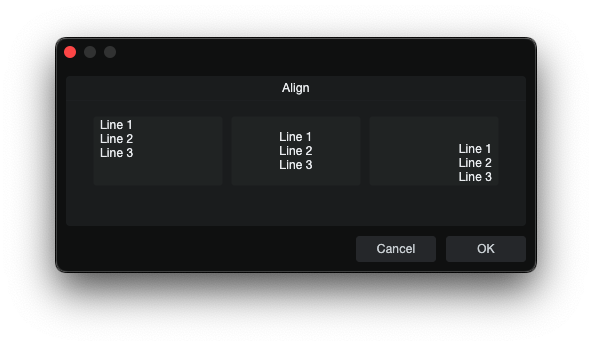
Align is a style helper that sets text alignment on controls that support it.
skin.xml Snippet:
<Styles>
  <Style name="AlignCenterEditBox" inherit="Standard.AddIn.EditBox">
    <Align name="textalign" align="center"/>
  </Style>
  <Style name="AlignRightTopEditBox" inherit="Standard.AddIn.EditBox">
    <Align name="textalign" align="right top"/>
  </Style>
</Styles>
| Attribute Name | Description | Type |
|---|---|---|
align | Alignment options. | token |
name | - | identifier |
Notes
Alignis used inside<Style>definitions. For the parameter-side population patterns used by the tested controls, see CCL:ParamList.- Confirmed working for
EditBox,ValueBox,TextBox,SelectBox, andComboBox.
Color
Color defines a named color slot inside a style.
skin.xml Snippet:
<Color name="textcolor" color="#FFFFFF"/>
| Attribute Name | Description | Type |
|---|---|---|
name | Color role name. | identifier |
color | Assigned color value. | color |
| name | Description |
|---|---|
backcolor.off | Background color for the off state. |
backcolor.on | Background color for the on state. |
backcolor | Background color. |
hilitecolor | Knob fill color. |
linkcolor | Link text color. |
forecolor | Foreground color. |
selectedtextcolor | Text color used for selected content. |
textcolor.on | Text color for the on state. |
textcolor | Primary text color. |
Font
Font defines a named font slot inside a style.
skin.xml Snippet:
<Font name="textfont" themeid="PresonusUI" size="13" bold="true"/>
| Attribute Name | Description | Type |
|---|---|---|
face | - | identifier |
name | - | token |
size | Font size. | number |
spacing | Font space. | number |
style | Font style options. | token |
themeid | - | identifier |
smoothing | - | token |
| name | Description |
|---|---|
textfont | - |
| smoothing | Description |
|---|---|
antialias | - |
| style | Description |
|---|---|
bold | Bold font weight. |
italic | Italic font style. |
normal | Normal font weight. |
underline | Underlined text. |
Metric
Metric defines a named value inside a style, consumed by the target control.
skin.xml Snippet:
<Style name="MyKnobStyle">
  <Metric name="circle" value="1"/>
  <Metric name="range" value="270"/>
  <Metric name="margin" value="12"/>
</Style>
| Attribute Name | Description | Type |
|---|---|---|
name | Internal Metric renderer key. | identifier |
value | Assigned numeric value. | number / flag |
| name | Description | Typical Consumers |
|---|---|---|
buttonMinWidth | Minimum button width. | Scroll button layouts |
buttonSize | Scrollbar button size. | ScrollView styles |
buttonstyle | Button style variant selector. | Toggle, RadioButton |
cellBottomAreaHeight | Height of the bottom area in a cell layout. | Cell/list layouts |
cellCornerRadius | Corner radius used for cell rendering. | Cell/list layouts |
cellWidth | Width used for cell rendering. | Cell/list layouts |
chooseIconSize | Chosen icon size. | Icon layouts |
circle | Enables circular arc rendering on knobs (1 = on). | Knob |
colorize.icon | Enables icon colorization. | Button, Toggle |
editmargin | Inner edit margin. | EditBox styles |
fill.icon | Icon fill scale factor. | Icon layouts |
headerHeight | Header height. | ListView |
iconSize | Icon size. | Icon layouts |
indicator | Enables the code-rendered indicator dot/arc (1 = on). | Knob |
indicatormargin | Inset for the indicator dot from the knob center. | Knob |
indicatorwidth | Width of the indicator arc line. | Knob |
margin | Outer margin or knob arc inset from control edge. | Knob, ScrollView, general |
maxIconHeight | Maximum icon height. | CommandBar |
maxIconWidth | Maximum icon width. | CommandBar |
minfontsize | Minimum font size. | Label, Button |
overlay.filmstrip | Marks the overlay image as a frame-based filmstrip (1 = on). | Knob |
padding.bottom | Bottom padding. | General |
padding.left | Left padding. | General |
padding.right | Right padding. | General |
padding.top | Top padding. | General |
popup.cellWidth | Popup cell width. | Popup layouts |
popup.offset.x | Horizontal popup offset. | PopupBox |
popup.offset.y | Vertical popup offset. | PopupBox |
range | Knob rotation range in degrees (common: 270). | Knob |
rowHeight | List row height. | ListView |
scrollBarSize | Scrollbar size. | ScrollView |
spacing | Space between items. | Containers |
strokewidth | Width of the knob's background arc stroke. | Knob |
tabHeight | Tab height. | TabView |
tabSpacing | Space between tabs. | TabView |
textoffset | Text offset. | Label/text layouts |
tilesize | Tile size. | Tile layouts |
topoverlay.filmstrip | Marks the topoverlay image as a frame-based filmstrip (1 = on). | Knob |
| decorform | <String> referencing a decorative form name to wrap the popup. |
Notes
Metricvalues are style-family specific, listed under observed consumer where known.- Several knob metrics work together:
circle=1+range=270+indicator=1+strokewidth+indicatorwidth+margin+indicatormarginto produce a full code-rendered knob arc. - Filmstrip metrics (
overlay.filmstrip,topoverlay.filmstrip) tell the engine to treat a corresponding image slot as a multi-frame sprite sheet rather than a static image. The engine selects the frame matching the control's current value. - Accepts integers, decimals, and
false(equivalent to0).
Triggers
Triggers is a container element inside <Style> that holds one or more <Trigger> definitions.
skin.xml Snippet:
<Triggers>
  <Trigger event="onMouseDown">
    <Invoker target="controller" name="myMethod" arg1="value"/>
  </Trigger>
</Triggers>
Trigger
Trigger defines an event-driven action inside <Triggers>. Each trigger listens for a specific event and executes its child <Invoker> when the event fires.
skin.xml Snippet:
<Trigger event="onMouseDown">
  <Invoker target="controller" name="myMethod" arg1="value"/>
</Trigger>
| Attribute | Description | Type |
|---|---|---|
event | Event name(s) that fire this trigger. | token |
| event | Description |
|---|---|
onAttached | Fires when the element is attached to the view hierarchy |
onContextMenu | Fires on right-click / context menu |
onDoubleClick | Fires on double-click |
onDrag | Fires during mouse drag |
onMouseDown | Fires on mouse button press |
onRemoved | Fires when the element is removed from the view hierarchy |
onSingleClick | Touch-friendly single-click event |
onSingleTap | Touch-friendly tap event |
onTouch | Touch event |
Notes:
- Multiple events can be listed on one
<Trigger>:event="onMouseDown onTouch". - Multiple
<Invoker>elements in one<Trigger>all fire in order.