Image & Shape Resources
Image
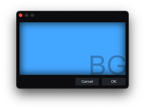
Image defines a named image resource.
skin.xml Snippet:
<Image name="BG1" url="images/BG1.png"/>

<Form name="ImageBackgroundTest" image="BG1">
  <!-- Form content -->
</Form>
| Attribute Name | Description | Type |
|---|---|---|
adaptive | - | flag |
duration | Total animation cycle time. | time |
frames | Frame sequence. | token |
image | Referenced Image resource. | identifier |
margin | Image margin. | tuple |
name | Referenced Image resource / slot key. | identifier |
size | Image size geometry. | tuple |
template | - | flag |
tile | Tiling mode. | token |
url | Asset path for the image resource. | identifier |
| adaptive | Description |
|---|---|
true | - |
| frames | Description |
|---|---|
normal | Default image frame. |
normalOn | On-state frame. |
normal0 normal1 normal2 | - |
t: *x* * | Tiled sprite-sheet frame expression. |
| template | Description |
|---|---|
true | - |
| name | Description |
|---|---|
background | Universal slot; primary image for any styled control. |
button | Dropdown button arrow for SelectBox. |
disabledoverlay | Disabled-state overlay for Knob. |
first | Left segment for TabView. |
foreground | Overlay image for Knob and ActivityIndicator. |
hBack | Horizontal track background for Slider. |
hHandle | Horizontal drag handle for Slider. |
icon | Overlay icon for Button and Toggle. |
last | Right segment for TabView. |
middle | Center segment for TabView. |
overlay | Filmstrip indicator for Knob. |
single | Single segment for TabView. |
topoverlay | Color-tint mask for Knob. |
vBack | Vertical track background for Slider. |
vHandle | Vertical drag handle for Slider. |
vSmallBack | Vertical scrollbar track for ScrollView. |
vSmallThumb | Vertical scrollbar thumb for ScrollView. |
| tile | Description |
|---|---|
repeat-xy | - |
stretch-xy | - |
stretch-y | - |
tile-x | - |
tile-xy | - |
Notes
urlis used for image assets such as PNG and SVG files in the package.- For
t:sprite sheets,3x3is the sprite-sheet grid size and the value after the space is the active frame count. Int: 3x3 8, the animation plays frames1through8and then loops back to1. durationsets the total time for one full animation cycle across the active frames.- When used inside
<Style>blocks,<Image>can assign a resource to an engine-recognized slot. Thenameattribute is a slot key the control renderer looks for.
ImagePart
ImagePart defines a named crop or state frame from an Image resource, used for atlas slicing and button/state graphics.
skin.xml Snippet:
<Image name="ButtonOffImage">
  <ImagePart name="normal" image="ButtonStateSheet" size="0,0,120,36"/>
</Image>

<Image name="ButtonHoverImage">
  <ImagePart name="normal" image="ButtonStateSheet" size="0,36,120,36"/>
</Image>
| Attribute Name | Description | Type |
|---|---|---|
duration | Total animation cycle time. | time |
frames | Frame/state sequence. | token |
image | Referenced Image resource name. | identifier |
margin | Crop margin. | tuple |
name | ImagePart resource name. | identifier |
size | Crop geometry | tuple |
tile | Tiling mode. | token |
template | - | - |
url | Asset path for the image part. | - |
| frames | Description |
|---|---|
darkframe | - |
disabled | - |
h: | Horizontal frame set prefix. |
lightframe | - |
mouseover | - |
mouseoverOn | - |
normal | - |
normalOn | - |
phaseOn | - |
pressed | - |
v: | Vertical frame set prefix. |
disabledOn | - |
normal0 | - |
normal1 | - |
normal2 | - |
pressedOn | - |
small | - |
| tile | Description |
|---|---|
repeat-x | - |
repeat-xy | - |
repeat-y | - |
stretch-xy | - |
stretch-y | - |
tile-x | - |
tile-xy | - |
tile-y | - |
Notes
ImagePartis used to carve out a sub-rectangle from a named image resource, including button-state atlases and other sliced UI image sheets.- The wrapped
Imagename is what other controls consume; theImagePartsupplies the cropped state slice inside it.
ImageFilter
ImageFilter defines a named filter for an ImagePart.
skin.xml Snippet:
<ImageFilter name="colorize" color="hsl(220,80,45)"/>
| Attribute Name | Description | Type |
|---|---|---|
name | Filter type. | token |
color | Filter color value. | color |
value | Numeric filter value. | number |
| name | Description |
|---|---|
blend | Blend filter. |
colorize | Colorize filter. |
lightadapt | - |
tint | Tint filter. |
Shape
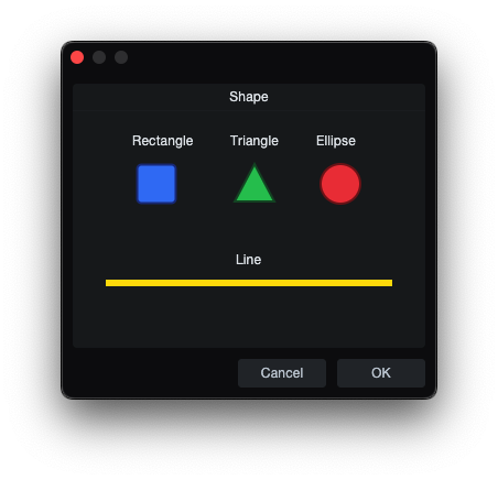
Shape defines one named vector object inside a top-level Shapes block.
skin.xml Snippet:
<Shape name="RoundedSquareShape" size="0,0,48,48" style="scale">
  <Rectangle size="4,4,40,40" style="fill stroke tiled margin"
             Brush.color="hsl(204,11,64)"
             Pen.color="hsl(0,0,12)"
             Pen.width="2"
             radius="6"/>
</Shape>
| Attribute Name | Description | Type |
|---|---|---|
name | Shape resource name. | identifier |
size | Size geometry. | tuple |
style | - | token |
| name | Description |
|---|---|
disabled | - |
focus | - |
mouseover | - |
normal | - |
normalOn | - |
pressed | - |
pressedOn | - |
| style | Description |
|---|---|
scale | - |
ShapeImage
ShapeImage exposes a named Shape as an image resource.
skin.xml Snippet:
<ShapeImage name="RoundedSquareIcon" url="RoundedSquareShape"/>
| Attribute Name | Description | Type |
|---|---|---|
adaptive | - | flag |
name | ShapeImage resource name. | identifier |
margin | - | tuple |
url | Referenced Shape name. | identifier |
frames | - | number |
template | - | token |
| adaptive | Description |
|---|---|
true | - |
| frames | Description |
|---|---|
embedded | - |
| name | Description |
|---|---|
mouseover | - |
mouseoverOn | - |
normal | - |
normalOn | - |
pressed | - |
pressedOn | - |
Rectangle
Rectangle is a rectangle primitive used inside Shape.
skin.xml Snippet:
<Rectangle size="4,4,40,40" style="fill stroke tiled margin"
           Brush.color="hsl(204,11,64)"
           Pen.color="hsl(0,0,12)"
           Pen.width="2" radius="6"/>
| Attribute Name | Description | Type |
|---|---|---|
size | Position and size geometry. | tuple |
style | Rectangle drawing style. | token |
Brush.color | Fill color. | color |
Brush.gradient | Fill gradient reference. | identifier |
Pen.color | Stroke color. | color |
Pen.width | Stroke width. | number |
radius | Rounded corner radius. | number |
style
| Values | Description |
|---|---|
fill | Enable fill. |
margin | - |
scale | - |
stroke | Enable stroke line. |
tiled | - |
Triangle
Triangle is a triangle primitive used inside Shape.
skin.xml Snippet:
<Triangle point1="24,6" point2="42,40" point3="6,40" style="fill stroke"
          Brush.color="hsl(204,11,64)"
          Pen.color="hsl(0,0,12)"
          Pen.width="2"/>
| Attribute Name | Description | Type |
|---|---|---|
point1 | First triangle point. | tuple |
point2 | Second triangle point. | tuple |
point3 | Third triangle point. | tuple |
style | Triangle drawing style. | token |
Brush.color | Fill color. | color |
Pen.color | Stroke color. | color |
Pen.width | Stroke width. | number |
| name | Description |
|---|---|
normal | - |
style
| Values | Description |
|---|---|
fill | Enable fill. |
stroke | Enable stroke line. |
Notes
point1point2point3use two value-tuple "x,y".
Ellipse
Ellipse is an ellipse/circle primitive used inside Shape.
skin.xml Snippet:
<Ellipse size="6,6,36,36" style="fill stroke"
         Brush.color="hsl(204,11,64)"
         Pen.color="hsl(0,0,12)"
         Pen.width="2"/>
| Attribute Name | Description | Type |
|---|---|---|
size | Position and size geometry. | tuple |
style | Ellipse drawing style. | token |
Brush.color | Fill color. | color |
Pen.color | Stroke color. | color |
Pen.width | Stroke width. | number |
style
| Values | Description |
|---|---|
fill | Enable fill. |
stroke | Enable stroke line. |
Line
Line is a line primitive used inside Shape.
skin.xml Snippet:
<Line start="0,0" end="10,0" style="stroke"
      Pen.color="hsl(204,11,64)"
      Pen.width="2"/>
| Attribute Name | Description | Type |
|---|---|---|
start | Line start point. | tuple |
end | Line end point. | tuple |
style | Line drawing styles. | token |
scalealign | - | token |
Pen.color | Stroke color. | color |
Pen.width | Stroke width. | number |
| style | Description |
|---|---|
stroke | Enable stroke line. |
tiled | - |
| scalealign | Description |
|---|---|
bottom | - |
right | - |
Notes
startandenduse a two-value tuple "x,y"